AI Talent Assessment & Interview Notetaker
The AI landscape is crowded, making it hard for new tools to earn user trust. Together, we solved two challenges: redefining the visual strategy and expanding the web application with a new feature set. We built a solid design system, added custom AI illustrations, and launched a high-conversion landing page. As a result, the startup claimed a clear niche in the market, providing a structured and transparent user journey for every talent acquisition specialist.
-

Brand Design
-

User Interviews
-

Web App Design
-

Landing Page
<4
Weeks to concept

+19
Features created

+15
Users interviewed


Aimed at HR specialists and hiring managers, the visual language combines a friendly office-fish character that humanizes the AI technology, making it feel more approachable.

Contents
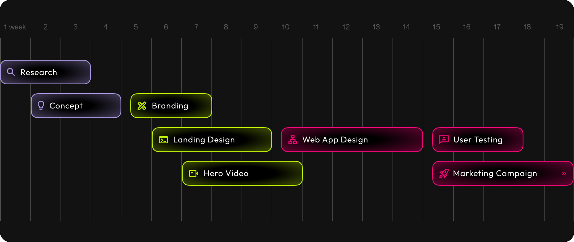
Timeline
We followed a flexible, adaptive process designed to surface insights early and iterate quickly.
About Project
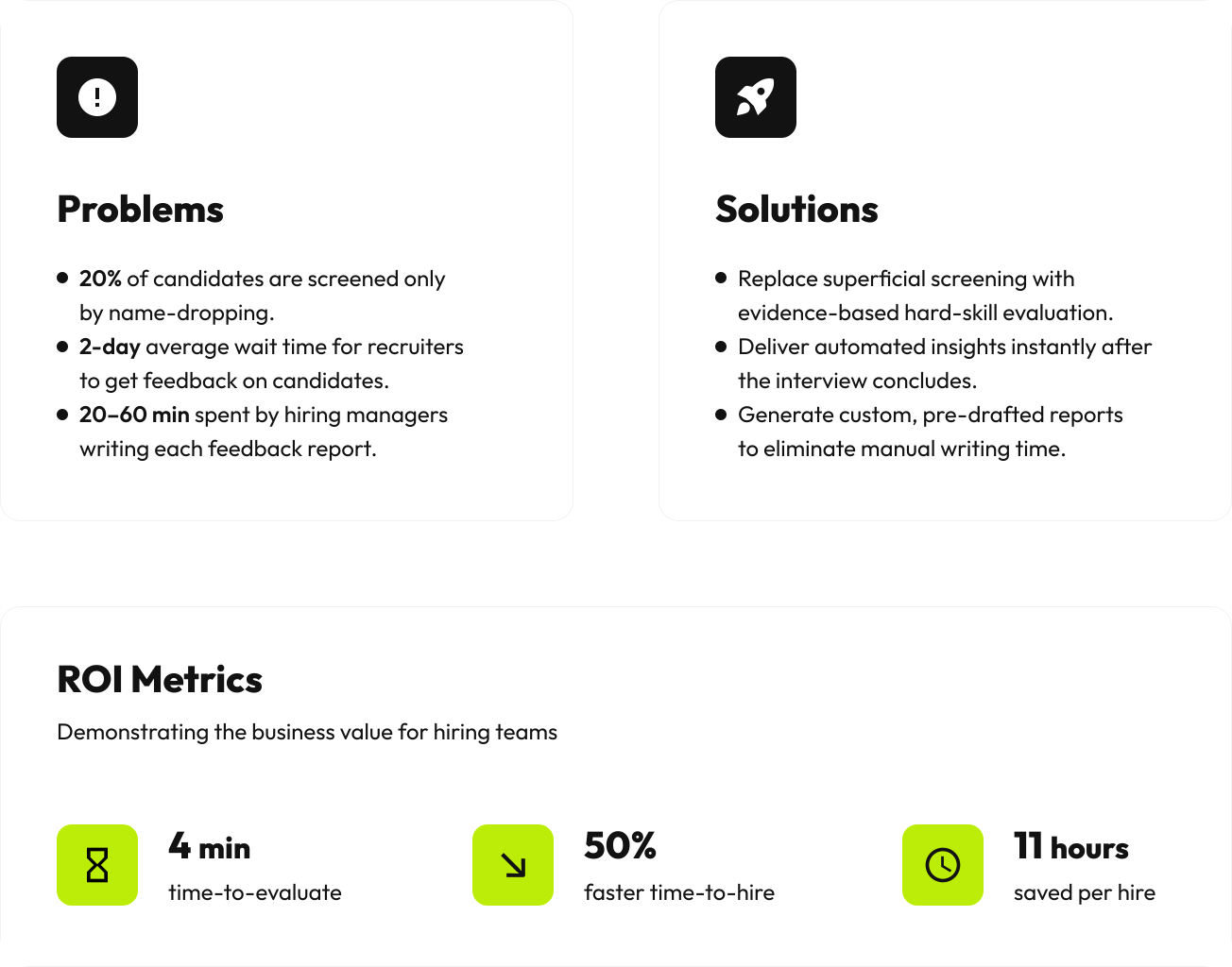
By aligning user pain points with business metrics, we established criteria to validate and continuously measure design success.
Web App Design
The user journey begins with an interactive product tour that streamlines account setup, helping recruiters start their first assessment right away.


Product Onboarding
Users can explore a product demo, experiencing the features through a candidate profile preloaded with sample interview data.




User Interviews
We conducted 15 usability testing sessions with active users to gather direct feedback on the current product experience.


User Flow
Using our research insights, we mapped out an optimized user flow designed to streamline the journey and eliminate usability friction.

Scorecards flow example
Landing Page
The landing page is designed to convert visitors into active users by demonstrating how the AI technology simplifies talent assessment.



Features Sections
Users can explore the core product features, previewing how the platform analyses interview records and scores the candidates.



Call to Action Sections
To turn interest into action, the page concludes with two distinct conversion paths: booking a personalized demo or starting a free trial.


Error Page
The 404 page extends the brand’s office-fish theme, softening user irritation while offering an obvious, single-click recovery journey.

Mobile Adaptive
The mobile layout delivers a seamless presentation that preserves structural hierarchy and drives on-the-go engagement.


Brand Design
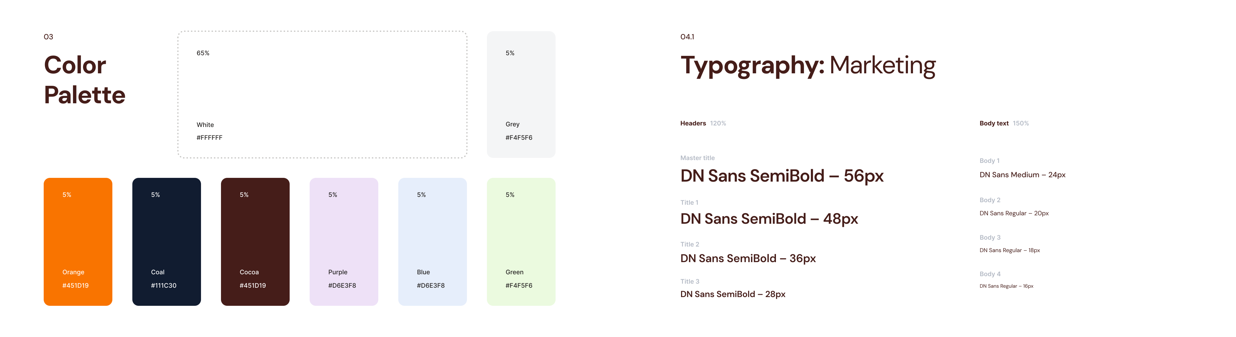
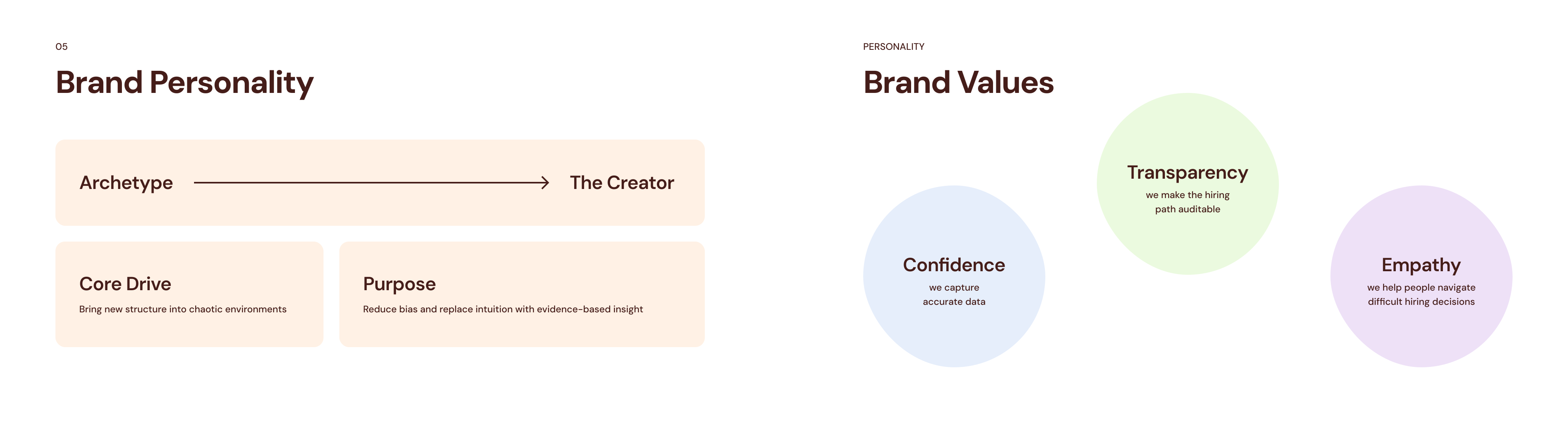
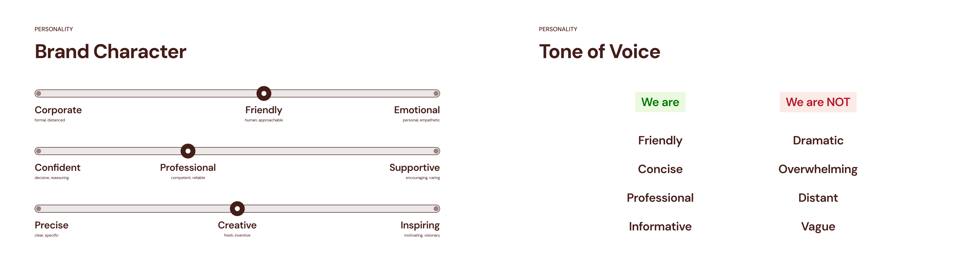
We crafted the visual language to look professional and trustworthy, ensuring it's tightly aligned with core business needs.

Brand Images
We introduced a set of illustrations styled as hand-drawn sketches to reflect the playful vibe of the existing logo. They were designed to build brand recognition across the product.

Brand Illustrations
We generated a set of AI illustrations introducing a friendly office-fish character, aiming to make the AI technology feel more approachable.
Social Media
The client asked for a witty twist, so we leaned into playful humor with a series of LinkedIn banners inspired by classic dad jokes. Today, prospects instantly recognize the brand on sales calls: "Oh, it's that company with the fish!"



view more